Samples for the enterprise Svg ui control for .NET8 (native) and MAUI
This repository holds samples and doc for the SVG control for Windows, Android, iOS and Mac. More infos


SvgImage and SvgImageSource
.net8 Maui Controls:
SvgImagedisplays an svgSvgImageSourcedisplays an svg inside buttons, tabs and more.
.net8 Native Controls (without maui):
- Android:
SvgImageViewandSvgPictureDrawable - iOS and Mac:
UISvgImageViewwith support for xcode designer
Quick start for MAUI
In MauiProgram.cs, add .UseEasySvg() to the builder
builder
    .UseMauiApp<App>()
    .UseEasySvg();
Add some SVG images
- Create a new folder "VectorImages" in your project. Do not use any existing 'Resources/Images' folder !
- put your SVG images there. Make sure they have the
.svgextension. - add the following lines to your .csproj file:
<ItemGroup>
  <None Remove="VectorImages\**\*.svg" />
  <EmbeddedResource Include="VectorImages\**\*.svg" />
</ItemGroup>
That configures those Svg images as embedded resources
In a XAML page, use SvgImage or SvgImageSource
<?xml version="1.0" encoding="utf-8" ?>
<ContentPage xmlns="http://schemas.microsoft.com/dotnet/2021/maui"
             xmlns:x="http://schemas.microsoft.com/winfx/2009/xaml"
             xmlns:svg="https://vapolia.eu/svg"
             x:Class="XamSvg.Demo.MainPage"
             IconImageSource="{svg:Svg myicon.svg,Height=60}">

  <ContentView>
    <StackLayout Orientation="Vertical" VerticalOptions="Start">

        <svg:SvgImage Source="logo.svg" HorizontalOptions="Start" HeighRequest="32" />

        <svg:SvgImage Source="logo.svg" HorizontalOptions="Start" HeighRequest="32"
                      ColorMapping="{Binding ColorMapping}"
                      ColorMappingSelected="ffffff=>00ff00,000000=>0000FF"
                      />

        <svg:SvgImage WidthRequest="100" Source="https://upload.wikimedia.org/wikipedia/commons/1/15/Svg.svg" />

        <svg:SvgImage WidthRequest="100" Source="data:image/svg+xml;base64,PD94bWwgdmVyc2lvbj0iMS4wIiBlb..." />

        <Image Source="{svg:Svg Source=no_image_available.svg, Width=40, ColorMapping='000=>666'}"
               WidthRequest="40" />

    </StackLayout>
  </ContentView>
</ContentPage>
Remarks:
- The
xmlns:svgattribute is required on theContentPage. Sourceis the name of an svg image. This image is searched in embedded resources across all loaded assemblies. This list is cached.- All properties are bindable.
You can also use <SvgImageSource Svg="...." Height="50" /> as the ImageSource for tab icons, button icons, navigation bar icons, ...
For those, the Widht and/or Height is mandatory and non bindable, as ImageSource objects are static in MAUI (limitation of MAUI).
The compact syntax ImageSource="{svg:Svg refresh.svg,Height=50}" is easier to use.
Note that SvgImageSource converts the svg image into a passive raster image displayed by another UI control like Image. The consequence is, it supports only one ColorMapping.
Color Mapping
The ColorMapping, ColorMappingSelected or ColorMappingDisabled properties are useful to change some colors in the SVG before displaying it, or depending on a state (normal, selected, disabled).
The string ffffff=>00ff00 000000=>0000FF means replace ffffff (white) by 00ff00 (green) and replace 000000 (black) by 0000FF (red).
A color mapping is a string which contains a list of mappings separated by "," or ";" or a space.
A mapping has two parts, separated by "=>" (or "="). The left part is the color that should be replaced by the color specified by the right part.
A color is a standard html color code: AARRGGBB, RRGGBB, or RGB. A is the transparency (alpha channel).
Color mappings are bindable: instead of specifying a string, use a list of ColorMapping:
<svg:SvgImage Source="logo.svg" HorizontalOptions="Start" HeighRequest="32">
    <ColorMapping OldColor="Blue" NewColor="#80000000" />
    <ColorMapping OldColor="#FFF" NewColor="{Binding YourColorProperty}" />
</svg:SvgImage>
Maui samples
Simple svg image
<svg:SvgImage Source="logo.svg" HeightRequest="70" HorizontalOptions="Center" VerticalOptions="Center" />
Svg image on a button
<Button Text="Add Contact" ContentLayout="Right,20" ImageSource="{svg:Svg tabHome.svg,Height=60,ColorMapping='000000=>FF0000'}" />
Svg image for the icon of a TabbedPage tab
<NavigationPage Title="Home" IconImageSource="{svg:Svg tabHome.svg,Height=60}">
  <x:Arguments>
      <views:HomePage />
  </x:Arguments>
</NavigationPage>
Svg image with bindable color mapping
<svg:SvgImage Source="logo.svg" HeightRequest="60">
    <!-- the ColorMapping property is the default content property: no need to embed it into a svg:SvgImage.ColorMapping tag -->
    <svg:ColorMapping OldColor="#000" NewColor="{Binding CurrentColor}" />
    <svg:SvgImage.ColorMappingSelected>
        <svg:ColorMapping OldColor="#000" NewColor="{Binding CurrentColor}" />
    </svg:SvgImage.ColorMappingSelected>
</svg:SvgImage>
Common mistakes
If nothing appears, make sure your svg is displayed correctly by the windows explorer (after you installed this extension).
Common errors include
- forgetting to set the build action of the svg file to "Embedded resource".
- missing viewBox attribute at the root of the svg file (open it using a text editor).
- the svg color is the same as the background color, especially white or black. Use ColorMapping to change colors, or edit your svg file with inkscape or your preferred text editor.
The assembly in which the svg resources are must have an assembly Name equal to its Default namespace, otherwise the svg files will not be found. If you are unable to do so, you can still display an svg but you will have to specify the full name of the resource like this:
    <svg:SvgImage
        Source="YourDefaultNamespace.Images.getFDR_01_Ready.svg"
        x:Name="SvgIcon" HorizontalOptions="Fill" VerticalOptions="Start" Margin="8,0,8,0" BackgroundColor="Yellow"
        />
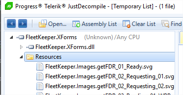
You can discover the full name of an embedded resource by opening your assembly (.dll in your bin folder) in the free tool Telerik JustDecompile.
Another common error is setting the ImageSource of a Button in a style or in a trigger. Instead you must set the Image property.
<Style x:Key="FAB" TargetType="Button">
  <!-- correct -->
  <Setter Property="Image" Value="{svg:Svg create.svg,Height=50,ColorMapping='000=>634109'}"/>
  <!-- incorrect
  <Setter Property="ImageSource" Value="{svg:Svg create.svg,Height=50,ColorMapping='000=>634109'}"/>
  -->
</Style>
Other Receipes
iOS or Android Native (not maui): set the license
Vapolia.Svgs.Config.License = "...";
Android native (not maui android): make the svg image height the same height of a Button
Click to expand
```xmlNote that as the svg has an intrinsic width computed from its height and its aspect ratio, the width displayed by the designer is incorrect. You can correct the designer by assigning a design time only value to layout_width using the tools prefix: tools:layout_width="30dp" which requires the xmlns:tools namespace declaration.
Android native (not maui android): set back button toolbar icon
var toolbar = FindViewById<Toolbar>(Resource.Id.toolbar);
toolbar.NavigationIcon = SvgFactory.GetDrawable("backward.svg", "000000=>FFFFFF");
iOS/Android: Load svg from a background thread
Click to expand
See [this gist](https://gist.github.com/softlion/17aea986a8ea3594595ddf869ee49b37)iOS storyboard (not maui ios): usage in an xcode storyboard
Click to expand
Using Visual Studio Mac, open your storyboard file using `Open with xcode`. Add an Image view (UIImageView), set its custcom `Class` property to `UISvgImageView`, and optionally add new `User Defined Runtime Attributes` as required:
| Key Path | Type | Sample Value |
|---|---|---|
| BundleName | String | info.svg |
| ColorMapping | String | 000000=e01a1a |
| ColorMappingSelected | String | 000000=ff3030 |
To size your svg, set contraints on one dimension only. The other dimension will be set using the first dimension and the computed aspect ratio. If you set constraints on both dimensions, the svg will stretch. You can prevent this by setting Aspect to Fit (along with ContentMode to AspectFit):
| Key Path | Type | Sample Value |
|---|---|---|
| Aspect | String | Fit |
When only one dimension is constrained, the designer don't know how to set the other dimension and displays contraint errors. The solution is to set the intrinsic size to a manual value in the dimension which has no contraint (in the dimension property pane of the designer).

- Select the
UISvgImageViewview. - Show the size inspector (⌘Shift5).
- Change the "Intrinsic Size" drop-down from "Default (System Defined)" to "Placeholder."
- Enter reasonable guesses at your view's runtime width or height. Width if you set contraints on the height, height otherwise.
These constraints are removed at compile-time, meaning they will have no effect on your running app, and the layout engine will add constraints as appropriate at runtime to respect your view's intrinsicContentSize.
MAUI
Default namespace:
xmlns:svg="https://vapolia.eu/svg"
SvgImage control
SvgImage displays a image in up to 2 states: normal, selected
<svg:SvgImage Source="union.svg" HeightRequest="70" HorizontalOptions="Center" VerticalOptions="Center" />
| Property | Type | Notes |
|---|---|---|
| Source | string or SvgSource |
svg to display. |
| ColorMapping | string or ObservableCollection<ColorMapping> |
see color mapping reference. Default to none. |
| ColorMappingSelected | string or ObservableCollection<ColorMapping> |
color mapping when IsSelected="True". Default to none. |
| IsSelected | bool | used to switch color mapping |
| IsSelectionEnabled | bool | True by default: the value of IsSelected is also inherited from the parent container |
| Command | ICommand | if set, execute this command on tap |
| CommandParameter | object | parameter to send when calling Command.Execute |
| Width | double | Optional. You can also specify the width only and height will be computed from the aspect ratio |
| Height | double | Optional |
| Aspect | SvgAspect | Fit, Fill, FitCrop. Useful only if both width and height are forced. Default to Fit to maintain the aspect ratio. |
| IsLoadAsync | bool | set to False to disable async image loading, making the image appear immediatly. Default to True. |
| IsHighlightEnabled | bool | if set, ColorMappingSelected is used while the image is pressed (until the finger is released) |
| ViewportTransform | IMatrix | transform the svg using any matrix before displaying it |
SvgImageSource class
SvgImageSource inherits from ImageSource, use it on any ImageSource property. For example Page.IconImageSource.
It can also be transformed into a FileImageSource by calling CreateFileImageSource().
SvgImageSource can be used in Button.ImageSource, ToolbarItem.IconImageSource, ...
<svg:SvgImageSource Source="tabHome.svg" Height="50" />
| Property | Type | Notes |
|---|---|---|
| Source | string or SvgSource |
svg to display. |
| Width | double | Optional. You can also specify the width only and height will be computed from the aspect ratio. |
| Height | double | Optional. |
| ColorMapping | string or ObservableCollection<ColorMapping> |
see color mapping reference. Default to none. |
| Aspect | SvgAspect | Fit, Fill, FitCrop. Useful only if both width and height are forced. Default to Fit to maintain the aspect ratio. |
| PreventTintOnIos | bool | Default to false. Prevents tinting on iOS, thus always displaying the original image. |
All properties are bindable, but Xamarin Forms does not support changing them after the control using this SvgImageSource is rendered. Alternatively, you can bind the ImageSource property on the target control, and define SvgImageSource in styles. Example:
    <svg:SvgImageSource x:Key="NormalIcon" Source="icon_normal.svg" Height="80" />
    <svg:SvgImageSource x:Key="SelectedIcon" Source="icon_selected.svg" Height="80" ColorMapping="FFF=>000" />

    <Style x:Key="NormalIconStyle" TargetType="ImageButton">
      <Setter Property="Source" Value="{StaticResource NormalIcon}"/>
      <Setter Property="BackgroundColor" Value="Transparent"/>
    </Style>

    <Style x:Key="SelectedIconStyle" TargetType="ImageButton">
      <Setter Property="Source" Value="{StaticResource SelectedIcon}"/>
      <Setter Property="BackgroundColor" Value="Transparent"/>
   </Style>
And usage:
<ImageButton Style="{Binding StyleKeyToUse}" />
     public string StyleKeyToUse {get;set;} = "NormalIconStyle";
     //Don't forget to call OnPropertyChanged(nameof(StyleKeyToUse)) after each change.
Android native (not maui android)
Click to expand
Layout properties:| Tag | Type | Default value | Notes |
|---|---|---|---|
| app:svg | string or resource id | (required) | .net embedded resource file path and name, or android resource id |
| app:colorMapping | string | (null) | example: FF000000=FF808080 |
| app:colorMappingSelected | string | (null) | example: FF000000=FFa0a0a0;FFFFFFFF=00000000 |
| app:colorMappingDisabled | string | (null) | |
| app:traceEnabled | bool | false | |
| app:loadAsync | bool | true | |
| app:aspect | enum | fit | fit, fill of fit_crop (new v3.1.0). fit_crop: Scale the image uniformly (maintain the image's aspect ratio) so that both dimensions (width and height) of the image will be equal to or larger than the corresponding dimension of the view (minus padding). |
| android:adjustViewBounds | bool | true | if true and aspect is not Fill, the svg view will grow or shrink depending on the svg size. |
| android:autoMirrored | bool | false | true to mirror image in RTL languages |
android:padding is respected, and included in the width/height measurement.
android:gravity is respected, and included in the width/height measurement. If the svg is smaller than its view, this property controls its centering.
iOS native (not maui ios)
Click to expand
UISvgImageView inherits UIImageView, so it's easy to use it in an xcode storyboard: drag an UIImageView and set its custom class to UISvgImageView. To set specific svg properties, add User Defined Runtime Attributes in the same pane where you set the custom class.
Attributes (supported in User Defined Runtime Attributes):
| Key Path | Type | Default value | Notes |
|---|---|---|---|
| BundleName | string | (required) | Svg path. Example: res:images.logo |
| BundleString | string | (optional) | exclusive with BundleName. The svg content as a string. |
| ColorMapping | string | (null) | example: FF000000=FF808080 |
| ColorMappingSelected | string | (null) | example: FF000000=FFa0a0a0;FFFFFFFF=00000000 |
| TraceEnabled | bool | false | |
| IsLoadAsync | bool | true | set to false to force the svg to appear immediatly, or if it disappears sometimes |
| AlignmentMode | string | TopLeft | TopLeft, CenterHorizontally, CenterVertically, Center. Can be combined (in code only). |
| Aspect | string | Fit | Fit, Fill, FitCrop. |
| FillWidth | number | 0 | The width the svg would like to have. 0 to let the OS decides using UI constraints or Frame value. |
| FillHeight | number | 0 | The height the svg would like to have. 0 to let the OS decides using UI constraints or Frame value. |
UIImageView.ContentMode is forced by UISvgImageView, so it has no impact. Use Aspect instead.
Advanced configuration
The svg files that don't specify the full path of an assembly are searched in the embedded resources of all loaded assemblies automatically. If you have late loading assemblies that are not detected, or if you prefer to manually specify the assemblies, call AddResourceAssembly. Example:
public class App : Application
{
    public App()
    {
        Vapolia.Svgs.Config.AddResourceAssembly(typeof(App), ...);
        ...
    }
...
Tools
On Windows install the microsoft powertoys to preview the svg files in windows explorer.
More infos
Commercial support available.
Licensing
Read all about licensing here Use the chat on this website to get the purchase link. Prepare the number of licenses you want, your business name (if any) and your country (for VAT).Source code is available for purchase too.